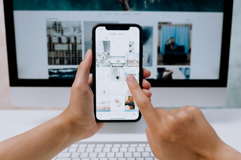
In today’s digital age, an engaging website layout is not just a luxury; it’s a necessity. How to design a website layout in 2024 involves not only aesthetics but also usability and functionality. Have you ever landed on a website that left you frustrated or confused?
You’re not alone! Many users face this issue, and it often stems from poorly designed layouts. In this article, we’ll address your pain points by breaking down the essential steps for creating a stunning, user-friendly website layout that captivates your audience.
Prepare to transform your website into a powerful tool that not only attracts visitors but also converts them into loyal customers. This guide will provide you with actionable insights and powerful techniques to elevate your website’s design.
From understanding the fundamentals to mastering advanced techniques, you’re about to embark on a journey that will enhance your web design skills and bring your vision to life.

1. Understanding Website Layout
Why is a Layout of a Website Essential?
The layout of a website is fundamental to its overall effectiveness and plays a crucial role in shaping users’ experiences. A well-structured layout serves as the backbone of your website, influencing how information is presented and consumed. It dictates not only the visual hierarchy of content but also how easily users can navigate through your site to find the information they seek.
An effective layout guides users seamlessly through their journey, allowing them to engage with your content and understand your brand message. Without a clear and intuitive layout, users may become frustrated and overwhelmed, leading to higher bounce rates and lost opportunities for conversion. Additionally, a thoughtful layout enhances usability, ensuring that essential elements—such as calls to action, navigation menus, and important information—are prominently displayed and easily accessible.
Moreover, a well-designed layout reflects the professionalism and credibility of your brand. It can evoke emotions, influence perceptions, and ultimately impact user trust. When users feel confident in the site’s design and functionality, they are more likely to engage, share, and return. Therefore, investing time and effort into creating a coherent and appealing website layout is essential for fostering positive user interactions and achieving your online goals.
2. Steps for Designing a Successful Website Layout
Step 1: Research and Plan
Before diving into the design process, it’s crucial to conduct thorough research and detailed planning. This foundational step is essential for creating a layout that not only looks good but also meets the needs of your audience. Start by understanding your target audience, including their demographics, preferences, and pain points. Use tools like surveys, interviews, and analytics data to gather insights into what your users expect from your website.
Additionally, analyzing competitors’ websites can offer valuable insights into industry trends and best practices. Take note of their design elements, navigation structures, and user engagement tactics. This competitive analysis can help you identify what works well and where there may be gaps that you can exploit to differentiate your site.
Once you have a solid understanding of your audience and competition, develop a comprehensive site map that outlines the structure of your website. This site map will serve as a visual guide for how your content is organized and how users will navigate through different sections of your site. A well-planned structure will ensure that users can easily find the information they are looking for, thereby enhancing their overall website experience.
Step 2: Sketch Your Layout
After conducting your research and creating a site map, it’s time to begin sketching your layout ideas. This step allows you to explore various design concepts and visualize how different elements will work together to form a cohesive layout. Whether you prefer traditional pen and paper or digital tools like Adobe XD or Sketch, the goal is to brainstorm multiple ideas without the constraints of a detailed design.
As you sketch, focus on the flow of information and how users will interact with various elements on the page. Consider how you can guide visitors from one section to another seamlessly. Think about the placement of key components, such as CTAs, images, and text blocks. Aim for a balance between visual appeal and functionality; your layout should be engaging but also serve its purpose effectively.
Once you have a collection of sketches, review them critically. Look for patterns or elements that stand out and could be combined into a single cohesive layout. Don’t hesitate to share your sketches with colleagues or friends to gather feedback. Different perspectives can provide insights you might not have considered, helping you refine your design before moving on to the next step.
Step 3: Create a Lo-Fi Wireframe
With your sketches as a reference, you can now create a low-fidelity (lo-fi) wireframe of your website layout. This wireframe serves as a basic outline, allowing you to visualize how various elements will be arranged on the page without getting bogged down by colors, fonts, or other design details. Lo-fi wireframes are an effective way to focus on functionality and layout structure while keeping things simple.
To create your lo-fi wireframe, consider using tools like Balsamiq or Figma, which provide user-friendly interfaces for wireframing. This step is particularly useful for brainstorming different layout configurations and determining how content will be prioritized.
As you create your lo-fi wireframe, keep user experience at the forefront of your mind. Ask yourself questions like: Are key elements easily accessible? Is there a logical flow from one section to another? Are there any potential obstacles that could confuse users? By critically evaluating your wireframe in this way, you can identify and address issues before they become more complex problems down the line.
Step 4: Create a Hi-Fi Wireframe
Once you’ve refined your lo-fi wireframe and gathered feedback, it’s time to transition to a high-fidelity (hi-fi) wireframe. This more detailed version incorporates specific design elements such as colors, fonts, images, and other branding components. Creating a hi-fi wireframe allows you to visualize how your website will look and feel, giving you a clearer idea of the final product.
When designing your hi-fi wireframe, consistency is crucial. Ensure that your color scheme, typography, and design elements align with your brand identity. This consistency helps build trust with your audience, making them more likely to engage with your content.
Additionally, pay attention to how your layout adapts across different devices. Responsive design is no longer an option; it’s a necessity. Your hi-fi wireframe should demonstrate how your layout will look on desktops, tablets, and mobile devices. Consider creating multiple versions of your wireframe for different screen sizes to ensure a seamless user experience across all platforms.
Step 5: Test Your Website Mockup
The final step in the design process is testing your website mockup with real users. This stage is critical for gathering insights into usability and aesthetics. Consider conducting usability tests with a sample group of your target audience. Observe how they navigate through your mockup, taking note of any confusion or frustration they experience.
Feedback collected during these tests can highlight pain points in your layout that you may not have noticed. For instance, users may struggle to find specific information or feel overwhelmed by cluttered sections. By identifying these issues early, you can make the necessary adjustments to enhance user experience before the final launch.
Additionally, consider using tools like UserTesting or Lookback to facilitate remote usability testing. These platforms allow you to gather valuable insights without needing users to be physically present. After gathering feedback, take the time to iterate on your design. Testing and refinement should be ongoing processes to ensure your layout meets user expectations and industry standards.
3. Essential Components of a Website Layout
Header
The header is the first thing users see when they land on your site, making it a crucial element of your website layout. It should prominently feature your logo, which serves as a visual representation of your brand, alongside a clear navigation menu that allows users to explore your site easily.
The navigation should be intuitive, helping visitors quickly find what they are looking for. Additionally, consider including a search bar in your header to further enhance user experience. A search bar allows users to bypass navigation menus altogether, providing them with direct access to the content they seek.
Furthermore, the header should be visually appealing yet straightforward. Avoid cluttering this area with too many elements, as a clean header will help users focus on their next steps. Incorporating a sticky header that remains visible while users scroll can also enhance usability, ensuring that navigation options are always within reach.
Main Navigation
Your main navigation menu is one of the most critical components of your website layout. It should be clear and easy to use, enabling visitors to navigate seamlessly between different sections of your site. A cluttered or confusing navigation menu can lead to frustration and increased bounce rates, as users may abandon your site in search of more user-friendly options.
To optimize your main navigation, stick to a limited number of top-level categories. This approach helps simplify the user experience and allows for easier exploration of your site. If necessary, utilize dropdown menus for subcategories to keep your navigation organized without overwhelming users.
Another essential consideration is the placement of your navigation menu. Typically, it is located at the top of the page, but it can also be positioned on the side or within a hamburger menu for mobile users. Regardless of the format you choose, ensure that your main navigation is consistent across all pages to provide users with a familiar experience.
Hero Section
The hero section is the area at the top of your homepage and is often the first thing visitors notice when they arrive at your site. It typically features a compelling image or video alongside a strong call-to-action (CTA). This section should effectively communicate your value proposition and capture visitors’ attention immediately.
To create a captivating hero section, consider using high-quality visuals that resonate with your brand and audience. A well-chosen image or video can evoke emotion and draw users into your content. Additionally, ensure that your text overlay is concise, clear, and persuasive, guiding users toward taking action.
Incorporating a strong CTA in your hero section is vital for encouraging user engagement. Use action-oriented language that prompts visitors to click, such as “Get Started,” “Learn More,” or “Shop Now.” Experiment with different placements and designs for your CTA button to determine what drives the best results.
Value Proposition Cards
Value proposition cards are an excellent way to showcase your main offerings or services. Each card should include a brief description, an engaging image, and a prominent call-to-action that encourages users to learn more or take action. This format is effective for presenting information in a visually appealing and easily digestible manner.
When designing your value proposition cards, focus on clarity and conciseness. Use persuasive language that highlights the benefits of your offerings and addresses user pain points. For example, instead of simply stating “Our Services,” you could say, “Transform Your Business with Our Tailored Solutions.” This subtle shift emphasizes value and engages potential customers.
Incorporating visuals into your value proposition cards can also enhance their effectiveness. Use high-quality images that are relevant to the service or product being offered. Additionally, ensure that the design of the cards aligns with your overall brand identity to create a cohesive user experience.
Sidebar
A sidebar can enhance your layout by offering additional navigation options or showcasing key information relevant to your content. However, it’s crucial to be mindful of how you use the sidebar to avoid cluttering the space. When designed effectively, a sidebar can serve as a helpful tool for guiding users through your site.
Consider using sidebars for popular posts, recent articles, or promotional content. This allows users to discover related information or offers without disrupting their main navigation experience. Be cautious not to overload your sidebar with too many elements, as this can detract from the overall aesthetic and usability of your site.
Additionally, think about the placement of your sidebar. Typically, sidebars are found on the right or left side of the main content area. Ensure that they complement your layout rather than distract from it. By carefully considering the design and content of your sidebar, you can create an effective space that enhances user engagement and drives conversions.
Call to Action (CTA)
Your CTAs should be strategically placed throughout your website layout to encourage user engagement and conversions. A well-designed CTA can make a significant difference in your site’s overall effectiveness. Ensure that your CTAs are visually distinct from other elements on the page, using contrasting colors or bold text to draw attention.
When crafting your CTA text, use persuasive and action-oriented language that motivates users to take the desired action. Instead of generic phrases like “Submit” or “Click Here,” opt for more compelling alternatives such as “Get Your Free Trial” or “Join Our Community.” This approach helps convey the value of clicking the button, increasing the likelihood of conversion.
Furthermore, consider the placement of your CTAs carefully. They should be positioned prominently within the layout, ideally near relevant content or after compelling sections that capture users’ interest. Testing different placements and designs for your CTAs can help identify the most effective strategies for driving engagement.
4. Tips for Creating an Attractive and Effective Website Layout

1. Embrace White Space
White space, often referred to as negative space, is a vital element in web design that can significantly enhance the user experience. This space around and between design elements helps prevent clutter and makes content easier to digest. A well-balanced use of white space creates a visually appealing layout, guiding users’ attention to key areas of your site.
To effectively incorporate white space, avoid cramming too much information into any single section. Instead, strive for a clean and organized appearance by providing adequate spacing between elements like text, images, and buttons. This not only improves readability but also helps create a sense of sophistication and professionalism.
Additionally, consider the overall balance of your layout. A design that feels cramped can overwhelm users, leading to frustration and increased bounce rates. Use white space strategically to guide users through your content, allowing them to focus on essential information and engage with your site more effectively.
2. Maintain Consistent Branding
Consistency in branding is critical for establishing trust and recognition among your audience. Ensure that your website layout reflects your brand identity through cohesive color schemes, typography, and imagery. This consistency not only enhances visual appeal but also reinforces your brand message, making it easier for users to connect with your values.
To maintain consistent branding, create a style guide that outlines your brand’s visual elements, including color palettes, font choices, and logo usage. This guide will serve as a reference for maintaining uniformity across your website and other marketing materials.
Additionally, think about the tone and voice of your content. A consistent tone helps establish your brand personality and fosters a deeper connection with your audience. Whether your brand is professional, friendly, or playful, ensure that your content aligns with your overall branding strategy.
3. Prioritize Mobile Responsiveness
In today’s digital landscape, mobile responsiveness is no longer optional; it’s a necessity. With a significant portion of web traffic coming from mobile devices, it’s crucial to ensure that your website layout adapts seamlessly to different screen sizes. A responsive design enhances user experience by providing a consistent and accessible interface across all devices.
To achieve mobile responsiveness, utilize responsive web design principles, including flexible grids and fluid images. Consider how elements will be rearranged or resized on smaller screens to maintain usability.
Testing your layout on various devices and screen sizes is essential to identify any issues that may arise. Utilize tools like Google’s Mobile-Friendly Test to assess the responsiveness of your site and make necessary adjustments to improve performance on mobile devices.
4. Use High-Quality Images and Graphics
Visual content plays a pivotal role in capturing users’ attention and enhancing engagement. High-quality images and graphics can make your website layout more attractive, helping to convey your message effectively. Ensure that all visuals are relevant to your content and align with your brand identity.
When selecting images, opt for original photography or high-resolution stock images that reflect your brand’s values and aesthetics. Avoid generic or low-quality images, as they can diminish the professionalism of your site.
Additionally, consider the use of infographics and custom graphics to present complex information in a visually appealing way. Infographics can help break up text-heavy sections, making content more digestible and engaging for users. When integrated thoughtfully, high-quality visuals can elevate your website layout and enhance overall user experience.
5. Test and Iterate
The process of creating an effective website layout doesn’t end once your site is live. Continually testing and iterating on your design is essential for ensuring optimal performance and user satisfaction. Regularly gather feedback from users, conduct A/B testing on various elements, and monitor analytics to identify areas for improvement.
Use tools like Google Analytics to track user behavior on your site, paying attention to metrics such as bounce rates, session duration, and conversion rates. This data can provide valuable insights into how users interact with your layout and highlight areas that may need refinement.
Additionally, consider conducting user surveys or usability tests to gather qualitative feedback on your design. Engaging directly with your audience can help you understand their needs and preferences, guiding future design decisions. By prioritizing testing and iteration, you can create a website layout that evolves alongside your audience’s expectations and industry trends.
5. Evaluating Your Website Layout’s Effectiveness
How to Know if Visitors Like Your Website Layout
Monitoring user behavior can provide valuable insights into how visitors interact with your layout. Use tools like Google Analytics to track metrics such as bounce rates, average session duration, and page views. These metrics can help you identify areas for improvement.
A/B Testing Different Layout Elements
A/B testing involves comparing two different versions of a webpage to determine which performs better. By testing different layout elements, such as CTAs, images, or navigation menus, you can gather data on user preferences and optimize your layout accordingly.

Conclusion
Designing a website layout in 2024 requires a blend of creativity, research, and user-centered thinking. By following the steps outlined in this guide, you can create an effective, visually appealing layout that enhances user experience and drives conversions. Remember, the key to a successful website layout lies in simplicity, usability, and ongoing testing.
Now that you’re equipped with the knowledge to create an impactful website layout, it’s time to put these strategies into action. Start designing today, and transform your website into a powerful tool that resonates with your audience!