As we dive into 2023, the landscape of logo designs has evolved to reflect a perfect blend of innovation and timelessness. The best logo designs this year showcase a striking balance between simplicity and complexity, making them memorable while still conveying the essence of the brand.
One standout trend is the use of bold typography combined with vibrant colors, which not only captures attention but also communicates brand identity effectively. Companies increasingly opt for minimalist designs that focus on clean lines and negative space, allowing their logos to be versatile across various platforms.
Moreover, 2023 has seen a rise in logos that incorporate dynamic elements or animated features for digital applications, enhancing user engagement. This forward-thinking approach demonstrates how brands are adapting to modern technology while maintaining a strong visual presence.
The best logo designs 2023 are not just about aesthetics; they embody strategic thinking and creativity that resonate with audiences. Investing in these contemporary design trends can elevate your brand’s visibility and relevance in an ever-competitive market.
“A logo doesn’t sell (directly), it identifies.” —Paul Rand
Logo Designs Main Topics:
- Scribbles and sketches
- Lay it on
- Text assortment
- Y2K 4ever
- Serifs with a twist
- Ornamental monograms
- Outer and inner space
- Dimensional playground
- Logo mascots
- Westward ho!
- Hand-drawn
- Lock it up: Illustration
- Lower that case
- Lock it up: Text
- Candy-core
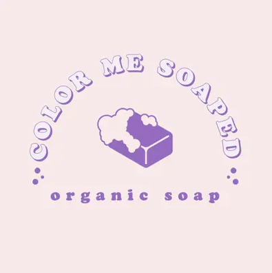
Scribbles and sketches
In 2023, logo design trends have embraced a more artistic and personal touch, with many brands opting for designs that feature scribbles and sketches. This approach adds a unique character to logos, setting them apart in an increasingly crowded marketplace. Scribbles can evoke feelings of creativity and spontaneity, while sketches often convey a sense of authenticity and craftsmanship.
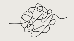
The use of hand-drawn elements allows brands to connect on a more personal level with their audience. It reflects a narrative that emphasizes the brand’s story, values, and dedication to originality. Companies are leveraging this trend by incorporating playful doodles or rough sketches into their branding strategies, making their logos not just symbols but also storytelling devices.
- The intentional playfulness of these logo designs reflects a unique fusion of graphic design sophistication and a nostalgic nod to the ’90s era.
- In a digital landscape often dominated by polished precision, these logos stand out by embracing a deliberate sense of unruliness, resonating with audiences on a personal level.
- Their deceptively simple appearance conceals a thoughtful design strategy, where each stroke and squiggle is carefully curated to evoke a sense of authenticity and genuine connection.
- By drawing inspiration from the past, these sketched-out logos not only tap into the timeless appeal of nostalgia but also contribute to a contemporary aesthetic that values relatability over rigidity.
As we navigate an ever-evolving design landscape, the allure of scribbles and sketches lies not only in their visual appeal but also in their ability to forge a connection through the artful celebration of imperfections, breathing life into the design world with a delightful blend of playfulness and purpose.
Lay it on
“Lay it on” serves as a captivating manifestation of the overlay logo trend, a design technique that intricately weaves multiple elements into a cohesive visual narrative. This trend, characterized by dynamic layering, allows for the strategic arrangement of diverse design components, resulting in a visually arresting and dynamic effect.
Each element within the overlay structure maintains its distinct identity while contributing to the overall logo design, showcasing a harmonious blend of individuality and unity.
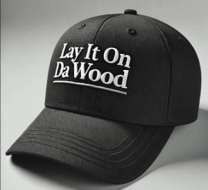
The brilliance of Lay it on lies in its ability to showcase the synergy of disparate elements, providing a nuanced glimpse into the thoughtfully constructed logo. Geometric shapes take center stage in this trend, adding a touch of modernity and structure to the visual composition.
The overlay technique emphasizes the distinct individuality of each element, creating a logo that is not only visually appealing but also conceptually rich.
Color transparencies play a pivotal role in enhancing the overlay technique, adding depth, dimension, and a layer of sophistication to the overall design. The use of transparency creates a visual interplay between elements, elevating the logo to a level of complexity that is both engaging and memorable.
Lay it on, stands as a testament to the evolution of logo design, where complexity converges with clarity. The careful layering of elements contributes to a rich tapestry of a logo that transcends the ordinary, embodying the essence of contemporary design innovation.
This trend not only breathes life into the logo but also establishes a seamless connection between diverse elements, offering a versatile and engaging aesthetic that resonates with the ever-evolving landscape of design excellence.
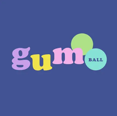
Text assortment
Text assortment refers to the careful combination of typography, font styles, and sizes that contribute to a logo’s overall effectiveness. A well-designed logo should not only be visually appealing but also convey the brand’s identity and values.
One of the best practices in text assortment is choosing fonts that complement each other. For instance, pairing a bold sans-serif font with a delicate script can create an engaging contrast that draws attention while maintaining readability. Additionally, considering the hierarchy of text elements—such as emphasizing the brand name while using secondary fonts for taglines—can enhance clarity and impact.
Color also plays an essential role in text assortment. The right color palette can evoke emotions and reinforce brand recognition. For example, vibrant colors may convey energy and creativity, while muted tones might suggest sophistication and reliability.
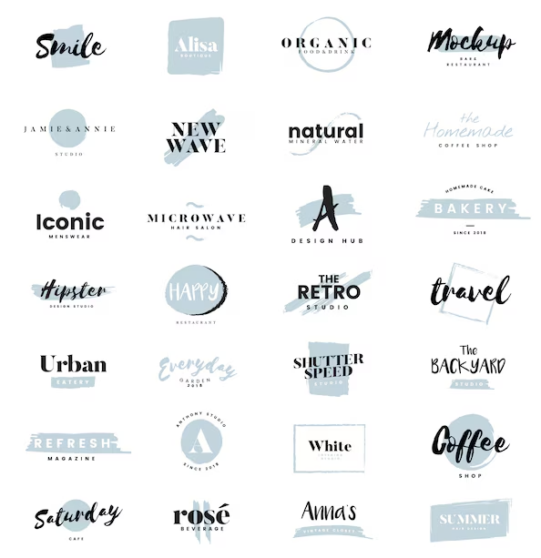
Ultimately, effective text assortment in logo design requires thoughtful consideration of typography choices, layout balance, and color schemes to ensure that the final product resonates with its intended audience while standing out in a competitive market.
Key Features:
- Varied Typefaces: The trend embraces a spectrum of typefaces, offering a rich and diverse palette for designers.
- Dynamic Mix-and-Match: The playful combination of text styles creates a visually dynamic and engaging logo.
- Freedom from Uniformity: Breaking away from clean lines liberates designers to explore the beauty in imperfections and uniqueness.
The text-based logo trend of the past year represents a celebration of diversity, an exploration of possibilities, and a departure from the conventional, ushering in an era where every curve and contour tells a story of creative liberation in the world of design.
Y2K 4ever
The Y2K aesthetic has made a significant comeback in recent years, influencing various design fields, including logo design. Characterized by its vibrant colors, playful typography, and nostalgic references to the early 2000s tech culture, the “Y2K 4ever” trend encapsulates a sense of fun and whimsy that resonates with both millennials and Gen Z.
When exploring the best logo designs within this aesthetic, brands often incorporate elements such as metallic finishes, bubble letters, and retro graphics that evoke a sense of nostalgia. These logos not only capture attention but also create an emotional connection with audiences who remember the era fondly.
Additionally, successful Y2K-inspired logos often utilize gradients and holographic effects to enhance their visual appeal. This approach not only aligns with current logo design trends but also helps brands stand out in a crowded marketplace. As we continue to see this trend evolve, it’s clear that Y2K-inspired logos are here to stay—offering a unique blend of nostalgia and modernity that can elevate any brand’s identity.
Key Characteristics:
- Nostalgic Reverie: Gen Z designers, with an acute sense of nostalgia, breathe new life into the Y2K aesthetic, reviving its essence with a contemporary flair.
- Tech-Human Ambiguity: The Y2K designs of 2022 and 2023 skillfully navigate the uncertain terrain where technology grappled with achieving a more human touch, creating a design narrative that speaks to both the past and the present.
- Dreamy Resonance: The inherent contrast between the dreamy softness and the earlier prevalent harshness and sterility of metallic and industrial forms defines the visual language of this trend.
This design resurgence not only establishes an immediate rapport with a fresh wave of designers but also serves as a poignant reunion for seasoned design veterans. The Y2K revival transcends mere aesthetics, embodying a collective journey through time, inviting designers of all generations to revisit and reinvent a pivotal epoch in design history.
In its cyclical nature, this trend seamlessly connects the dots between past, present, and future, fostering a design landscape that is both nostalgic and forward-looking.
Serifs with a twist
One of the most captivating trends is the use of serifs with a twist. This approach combines traditional serif fonts, known for their classic and elegant appearance, with innovative modifications that breathe new life into them. Designers are increasingly experimenting with these serifs to create logos that stand out while maintaining a sense of sophistication.
Serifs with a twist often involve playful alterations such as unexpected angles, unique curves, or even asymmetrical elements. These tweaks not only enhance visual interest but also memorably convey a brand’s personality. For instance, brands aiming for a modern yet timeless look can benefit from this design style by showcasing their commitment to tradition while embracing contemporary aesthetics.
As businesses continue to seek distinctive identities in saturated markets, exploring logo designs that incorporate these creative serif variations can lead to impactful branding solutions.
- Playful Transformation: Serifs are shedding their traditional seriousness, embracing a more whimsical and light-hearted character in design applications.
- Breaking Tradition: Departing from their historical use in lengthy newsprint and literature, serifs are breaking free from conventional constraints to explore new realms of visual expression.
- Art Deco Reimagined: The resurgence of serifs challenges the darker tones associated with Art Deco-era titling, offering a contemporary twist on a classic design element.
- Innovative Logo Designs: Serifs are reclaiming the spotlight in logo design, bringing a delightful twist to branding with their newfound playful and carefree spirit.
This renewed embrace of serifs showcases the adaptability of design elements over time, highlighting their ability to transcend historical conventions and find innovative applications in the ever-evolving world of visual communication.
As 2023 unfolds, the playful resurgence of serifs promises to leave an indelible mark on logo design, inspiring creativity and pushing the boundaries of typographic expression.
Ornamental monograms
Ornamental monograms have emerged as a popular choice in the realm of logo design, offering a unique blend of elegance and personalization. These logos typically feature intertwined letters, often representing the initials of a brand or individual, and are adorned with intricate decorative elements that enhance their visual appeal.
One of the key advantages of ornamental monograms is their versatility; they can be adapted to suit various industries, from luxury fashion brands to artisanal craft businesses. The ornate details not only convey sophistication but also create a memorable impression that can set a brand apart in a crowded marketplace.
When designing an ornamental monogram, it’s essential to consider factors such as typography, color palette, and overall composition. A well-crafted monogram should reflect the brand’s identity while remaining legible and recognizable at different sizes. Additionally, incorporating unique design elements can further personalize the logo, making it resonate more deeply with target audiences.
Key Points:
- Letter Marks Redefined: Monograms, synonymous with letter marks, break free from institutional norms, adopting a more expressive and ornate design language.
- Contemporary Resurgence: Recent times witness a metamorphic shift in monogram design, liberating it from historical rigidity to embrace newfound creativity.
- Ornamental Aesthetic: The classic monogram undergoes a creative renaissance, incorporating ornamental elements that introduce layers of intricacy to its visual composition.
- Layers of Complexity: The modern monogram boasts additional layers, contributing to a nuanced and visually compelling graphic narrative.
- Expressive Design: Strategic use of contrasting colors and diverse typefaces elevates the monogram, infusing each design with a heightened sense of expressiveness and individuality.
This evolution challenges preconceptions, positioning monograms as vibrant and versatile entities within the ever-evolving tapestry of logo design, with each iteration making a bold statement in the intricate dance between tradition and innovation.
Outer and inner space
Embracing the avant-garde spirit of design, the contemporary landscape of minimalism in 2023 is defined by a compelling interplay of space and type. This innovative aesthetic transcends traditional norms, ushering in a visual language that captivates through the nuanced intersections between letters and the expansiveness of negative space.
Within this paradigm, the utilization of guided lines emerges as a powerful technique, a deliberate maneuver that breathes life into the design canvas. Bullets of creativity punctuate this transformative approach:
- Guided Lines Redefining Typography: The deliberate use of guided lines takes typography beyond its conventional boundaries, creating a visual synergy that challenges the ordinary.
- Negative Space as a Design Element: Beyond mere emptiness, negative space not only becomes a canvas in itself, but also allows for the establishment of structure and form where previously none existed.
- Logo’s Spine: A Metaphor for Stability: Through meticulous manipulation of space, logos acquire a metaphorical spine, providing them with a sense of stability and purpose that resonates with audiences.
- Anchors of Visual Narratives: The strategic connection of type and the judicious use of negative space act as anchors, grounding the logo in a narrative that is both visually compelling and conceptually rich.
- Exploring New Directions with Playfulness: Minimalism in 2023 is not devoid of playfulness. The intentional manipulation of space and type opens the door to exciting, unforeseen directions, injecting an element of fun and unpredictability into logo design.
This paradigm shift marks an exciting juncture in the evolution of graphic design, where the fusion of space and type transcends mere visual appeal, giving birth to logos that narrate stories, evoke emotions, and redefine the boundaries of creative expression.
Dimensional playground
Step into the future of graphic design with the evolution of logos in 2023. The dimensional playground beckons, inviting you to witness the transformation of logos into multi-dimensional masterpieces.
This trend is not merely a departure from the static; it’s a leap into dynamic representation. Picture logos with depth, layers intricately woven to create a visual symphony. The addition of these layers is like giving life to once-flat symbols, pulling apart text to reveal hidden meanings, and building up concepts that, in turn, playfully interact with the viewer.
Furthermore, it becomes a sensory experience where each logo is not confined to the two-dimensional constraints of a page; rather, it leaps into the third dimension, thereby engaging and captivating its audience.
Key Features:
- Layered Brilliance: Logos go beyond the surface, incorporating layers that add depth and complexity.
- Textual Unveiling: Text isn’t static; it unravels, unveiling layers of meaning and adding an element of intrigue.
- Conceptual Build-Up: Every logo becomes a canvas for building concepts, creating a narrative that unfolds visually.
- Interactive Dynamics: These logos aren’t just images; they interact with the viewer, creating a memorable and immersive experience.
- Visual Pop: The very essence of these logos is to pop out from the page, demanding attention and leaving a lasting impression.
In 2023, the logo is not just a symbol; it’s a dynamic piece of art that transcends traditional boundaries, inviting you to explore, engage, and be captivated by the limitless possibilities of design.
Logo mascots
Successful logo mascots are typically simple yet distinctive, allowing for easy recognition across various platforms. For example, brands such as Michelin, with its iconic Bibendum, and Kellogg’s, featuring Tony the Tiger, have successfully leveraged mascot logos. As a result, these mascots have helped establish strong connections with audiences and leave lasting impressions over time.
These characters often tell a story or convey emotions that align with the brand’s message, enhancing customer connection. Moreover, effective use of color and design elements in mascot logos can evoke specific feelings and associations.
A well-designed mascot can become an integral part of marketing campaigns, appearing in advertisements, merchandise, and social media content to reinforce brand loyalty.
Here’s a closer look at what makes this trend so compelling:
- Diverse Expressions: Logo mascots offer a wide range of expressions, allowing brands to convey different emotions and messages.
- Versatility in Design: From minimalistic doodles to intricate, fully animated characters, logo mascots provide versatility in design, catering to various brand aesthetics.
- Memorability Factor: The use of mascots enhances brand memorability, creating a lasting impression in the minds of consumers.
- Dynamic Storytelling: Animated logo mascots bring brand stories to life, offering a dynamic and immersive way to connect with audiences.
- Template Integration: Seamlessly integrate this trend into your brand identity with customizable templates, ensuring your logo mascot aligns with your unique vision.
In this evolving design landscape, the utilization of logo mascots goes beyond mere aesthetics, presenting an opportunity for brands to connect emotionally with their audience and leave an indelible mark in the competitive market. Explore the templates below and embark on a journey to infuse your brand with a distinctive personality that resonates with the spirit of 2023.
Westward ho!
Embarking on a visual journey reminiscent of the iconic call, “Westward ho!” the landscape of logo design in 2023 takes inspiration from the rich tapestry of Western and Americana styles, creating a captivating fusion of tradition and innovation.
In a nod to the 2022 Art Nouveau resurgence, this trend employs retrofuturism as its guiding aesthetic principle, seamlessly marrying the design sensibilities of bygone eras with the technological advancements of today. Picture a logo that not only serves as a time capsule, encapsulating the rugged charm of the Wild West, but also seamlessly embraces the sleek sophistication of contemporary design tools.
Key Elements of the 2023 Logo Design Frontier:
- Retrofuturistic Synergy: The synergy between historical aesthetics and futuristic design elements serves as the cornerstone, offering a visually compelling narrative that bridges the gap between past and present.
- Americana Resurgence: Echoing the sentiment of Westward expansion, logos draw inspiration from Americana motifs, celebrating the spirit of adventure, individualism, and the untamed frontier.
- Technological Tapestry: The incorporation of cutting-edge technology seamlessly weaves into the nostalgic fabric, creating a dynamic visual experience that not only honors tradition but propels it into the digital age.
- Psychedelic Undertones: Building upon the psychedelic design wave of 2022, logos take on a vibrant, kaleidoscopic quality, injecting a sense of playfulness and creativity into the narrative of Western and Americana aesthetics.
In the tapestry of logo design, the 2023 frontier beckons—a terrain where vintage allure meets modern innovation, and the visual language of the past and future converges to forge something entirely novel and evocative.
Hand-drawn
Among the various styles of logo designs, hand-drawn logos have gained significant popularity for their unique and personal touch. These logos are characterized by their artistic flair and organic feel, often evoking a sense of authenticity and creativity. Hand-drawn logos can effectively convey the personality of a brand.
The imperfections inherent in hand-drawn designs add character and warmth, setting them apart from more polished digital logos.
- Authentic Expression: Hand-drawn logos provide a canvas for authentic expression, allowing brands to showcase the human touch behind their identity. The deliberate departure from polished digital aesthetics fosters a connection that feels personal and unfiltered.
- Romantic Unfinished Aesthetics: The intentional ‘unfinished’ quality of hand-drawn logos adds a romantic dimension to brand imagery. This departure from the sterile precision of digital design creates a visual narrative that echoes the spontaneity of real-life moments.
- Conveying Brand Personality: Beyond aesthetics, hand-drawn logos become powerful storytellers, conveying a brand’s personality in each stroke. The nuances and idiosyncrasies inherent in hand-drawn art imbue the logo with a sense of character, making it more than just a visual identifier but a storytelling element in itself.
Lock it up: Illustration
The logo is often the first impression consumers have of a business. Among the various styles of logo designs, illustrative logos stand out for their creativity and ability to convey a story. One notable trend in this category is the “Lock It Up” approach, which emphasizes strong visual elements that encapsulate a brand’s essence.
Illustrative logos can effectively communicate complex ideas through simple imagery. They often incorporate unique illustrations that reflect the brand’s personality and values, making them instantly recognizable. For instance, brands in creative industries frequently opt for illustrative logos to showcase their artistic flair and innovation.
The “Lock It Up” concept encourages designers to create cohesive illustrations that not only represent the brand but also lock in its identity through consistent visual language. This method ensures that every element of the logo works harmoniously together, reinforcing brand recognition across various platforms.
In summary, when considering logo designs, opting for an illustrative style with a “Lock It Up” philosophy can lead to impactful branding that resonates with audiences and stands out in today’s competitive market.
Lower that case
Lowercasing emerges as a powerful tool, infusing a sense of minimalism that breathes life into a more playful typographic approach. This departure from the dominance of uppercase letters challenges preconceived notions, proving that sophistication isn’t confined to the realm of business-class aesthetics.
Lowercase letters are not just an alternative; they are a compelling choice capable of delivering messages with impact and finesse. This logo trend embraces versatility, breaking free from conventional norms.
Key Features of the 2023 Logo Trend:
- Minimalistic Elegance: The shift to lowercase introduces a subtle, yet impactful, form of elegance that resonates with simplicity.
- Playful Typography: Explore a more dynamic and playful side of typography, where lowercase letters infuse a sense of creativity and approachability.
- Inclusive Design: Uppercase letters no longer hold exclusive rights to sophistication; lowercase letters bring inclusivity to the forefront, catering to a diverse audience.
- Versatility Redefined: Witness a revolution in logo versatility as lowercase letters prove their adaptability across industries and styles.
- Breaking Tradition: Challenge the conventional association of uppercase letters with formality; embrace a new era where lowercase gets the job done with equal, if not more, flair.
In this exciting landscape, the 2023 logo trend redefines the rules, encouraging designers to explore the uncharted territory of lowercase aesthetics and discover the myriad possibilities it unfolds.
Lock it up: Text
A well-designed text logo should prioritize legibility while also reflecting the brand’s personality. For example, a tech company might opt for sleek, modern typography to convey innovation, whereas a boutique might choose elegant script fonts to evoke sophistication. Moreover, color choice plays a crucial role in enhancing recognition; bold colors can grab attention, while softer hues may suggest calmness and reliability.
In fact, some of the best logo designs utilize this “lock it up” technique effectively by ensuring that their text is not only visually appealing but also versatile across various mediums—ranging from business cards to digital platforms.
By focusing on simplicity and clarity in their text logos, brands can create lasting impressions that resonate with their audience.
Key Features:
- Dynamic Typography: Typography is no longer confined to conveying messages; it actively contributes to the visual storytelling of a brand.
- Geometric Precision: Circles, archways, and tombstone-based shapes dominate, providing a structured and visually appealing foundation for text integration.
- Illustrative Functionality: Text is not just a static element but a dynamic tool, seamlessly merging with design elements to create a harmonious visual narrative.
- Strategic Encasement: Beyond aesthetic considerations, the text lock-ups strategically encase brand information, ensuring a cohesive and organized presentation.
As we delve into the nuances of “best logo designs 2023,” it becomes evident that this shift towards integrated, illustrative text is a defining characteristic, promising a visual landscape where every element plays a purposeful role in conveying the essence of a brand.
Candy-core
Embark on a design revolution as Candy-core takes center stage in shaping the visual landscape of brand logos in 2023. Picture your brand logo transforming into a vibrant masterpiece, infused with the irresistible allure of candy color pops. The design sphere is buzzing with excitement as this trend sweeps across the industry, elevating logos to new heights of creativity.
Diving into the Candy-core phenomenon, envision a pastel rainbow dessert palette that captivates the eye and captures the essence of sweetness. This departure from the 2021 “Chobanicore” trend wave is nothing short of a visual feast, steering towards the exuberant realm of bubble gum pop art as the latest visual guide.
- Candy Color Pops: Immerse your brand in a kaleidoscope of candy-inspired hues that bring vivacity and energy to your logo.
- Pastel Rainbow Dessert Palette: Explore the charm of a pastel rainbow, creating a visual symphony that resonates with the delightful experience of desserts.
- Chobanicore Evolution: Witness the sharp left turn from the 2021 “Chobanicore” trend, marking a transformative journey towards a more playful and dynamic aesthetic.
- Bubble Gum Pop Art Influence: Embrace the bold and whimsical influence of bubble gum pop art, setting the tone for the new visual guide in logo design.
In this era of Candy-core, logos transcend mere symbols; they become vibrant expressions of creativity, inviting your audience into a world where design is a delightful journey. Brace yourself for a logo revolution where each design element is a brushstroke on the canvas of brand identity, painted with the sweet hues of Candy-core innovation.